Kitchen Update
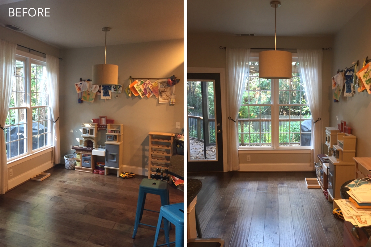
When there are small children in the house, you keep them close -- and when there are four kids under the age of four, you keep them very close. This usually means that they, and the stuff that comes with them, takes over all of the communal (formerly adult) living spaces. My clients were no different: the play kitchen and the kids had taken over their space. Their main need was a space that was still useful for the kids, but styled for adults.
We created a playroom in another area of the house. We removed the kid-sized furniture and kid-themed clutter in the kitchen, swapping it out for adult-sized (and styled), functional pieces.
When the kids dominated the space, their toys were on the floor and their art was all over the wall. We replaced the kids' art with a large, floral print. With five males and one female in the house, the print needed to be feminine and floral to balance that universe. While we're unseating the children, we can't entirely kick them out of the space: it's just fit for the adults now. We can maintain our style while also encouraging childhood creativity, so we stored all of the art supplies in a simple, modern console. Friends: furniture doesn't have to be from the kids section at IKEA to be functional.
We installed a wine rack to keep the wine out of arms reach of the kids, while also being well within arms reach of the adults. Speaking of coping mechanisms, we selected an inexpensive rug with a pattern to hide spills and the molded chairs are easily wiped down after mealtime. We framed the windows with graphic, black curtains and lit the space with a funky rattan pendant that provides a natural element (and is very on-trend as the 1970s visit us again).
Brilliant kitchen restyling: a functioning, kid space that's styled for the adults.


