Fresh, Blue, and like Kelly Ripa
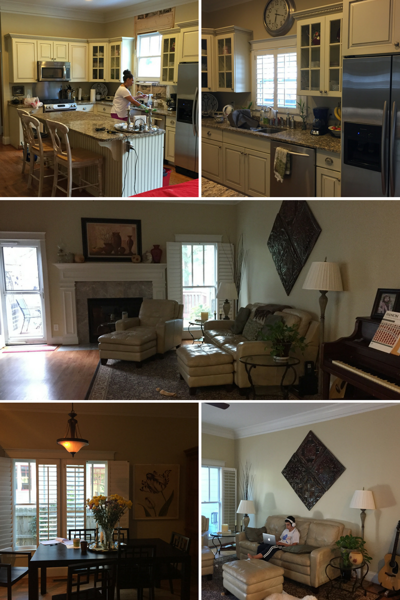
When my client called, she was knee deep in construction dust. She had her architect draw up plans to open up the house, add a porch with a skylight to the house with gorgeous doors and transom windows to let as much light in as possible. The interior of the house had the fireplace moved and added a banquette window seat for the dining area. When I arrived to look at the house, construction had already started and my client was nervous. She realized that putting her old furniture in her newly renovated space would simply mean that it looked like her old space, but lighter.
She decided to make the most of her renovation by letting Gina Sims Designs complete the transformation! (And you can too! Go ahead: hire me.)
We had a blast going through the attic looking for art and hearing stories of pieces she loved but were tucked away in corners or guest rooms instead of where she could look at them everyday. We were able to tweak some of the design to go with the direction we were headed. She gave me a magazine picture of a story done on Kelly Ripa’s house that she loved and a design plan was hatched. She has a teenager and big dogs and loves to entertain, so that was the starting point - that the house should be enjoyed, hard.
In the kitchen, we painted the cabinets white to lighten everything up and then painted the island blue to create some interesting contrast. We kept the blue moving through the kitchen with a roman shade above the sink, blue glass tile backsplash, a runner and some blue accessories: a tray with a blue pitcher for flowers.
Given that we wanted the space to be livable and enjoyable, a window seat was added providing storage while pillows keep it comfortable. The cafe curtain and new lanterns provide control lighting and privacy. I love integrating items that my clients already have and love. We kept her original table and chairs, but utilized some amazing plates she scored on a trip to Spain.
In the living room, we chose upholstery fabrics that could handle rough and tumble activity and defined the space with a textured rug.
The neutral palette set off the art we chose for the space. Above the piano, I grouped together pieces painted by relatives and those that she picked up traveling for maximum impact.
We also defined a new reading corner and added shelving.
In the outdoor area, she wanted it to look more like a living room than a patio. The walls were screened in, so we had to use all-weather finishes in all the furniture and upholstery. The wood is teak, upholstery is Sunbrella and cushions can be remade in a few years when she’s ready. The inexpensive blue chairs were covered in an all weather spray on the fabric and legs. Utilized plants to complete the feel of bringing the outdoors in and making use of all that great light!
The rug was outdoor and the rest of the furnishings can be easily wiped clean or hosed off but it still feels cozy and fresh. She does yoga on the patio and entertains there on the regular when the weather is nice.


