Color Boost, The Sequel
When I first worked on this beautiful house for this lovely newly married couple, they liked the back living space of their house but did not know what to do with the front dining room, entry and reading room. When we finished that, they loved it so much, the living space now needed to catch up! This year, we were fortunate enough to do that to complete the first level of the house. When we go through the design process together, I am always thrilled to be invited back into their lives! I love repeat customers.
The house was a new build and they were figuring out what they liked when they built it. Often, our initial style might look a lot like our parents’. It is a gorgeous home but they might do things a bit differently today. Common story for a lot of us, right?
They did not want to modify the kitchen since it was practically brand new, but accessorize and address the easy parts to make it flow with our other interior changes. We added new island lighting and a great Roman shade, art, aqua upholstered stools and added fun accessories to make it feel warm and full of life.
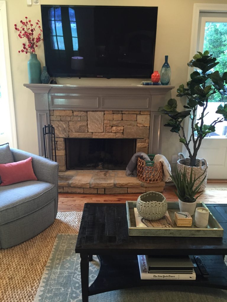
The living room got a jolt of awesomeness with a whole new color palette, carried in from the previous design job. We painted the mantle a warm dark gray and painted the coffer ceiling with a gorgeous pale aqua blue. The sectional is a beautiful navy and we accented in coral and aqua with our pillows, rug (layered on top of our large jute) and accessories. I had fun with the mantle vases and art up the staircase.
The tile detail in the before picture in the back bar area was copper and not conducive to our design, so we had a wood insert made and painted navy to match the front entry way, creating a lovely back drop that does not take away from the room.
The bathroom got gorgeous wall paper in the color of the living room coffers and a new chest, lighting, bold art and vases and the existing vanity was painted gray to modernize the look.


