A Distillery Owners’ Masterpiece
Our clients opened the Distillery of Modern Art in Atlanta, an amazingly cool blend of art gallery and distillery, so it should be no surprise that in their home they prioritize the unique. Given that, our mission was to make sure everything in their house was all shades of fabulous.
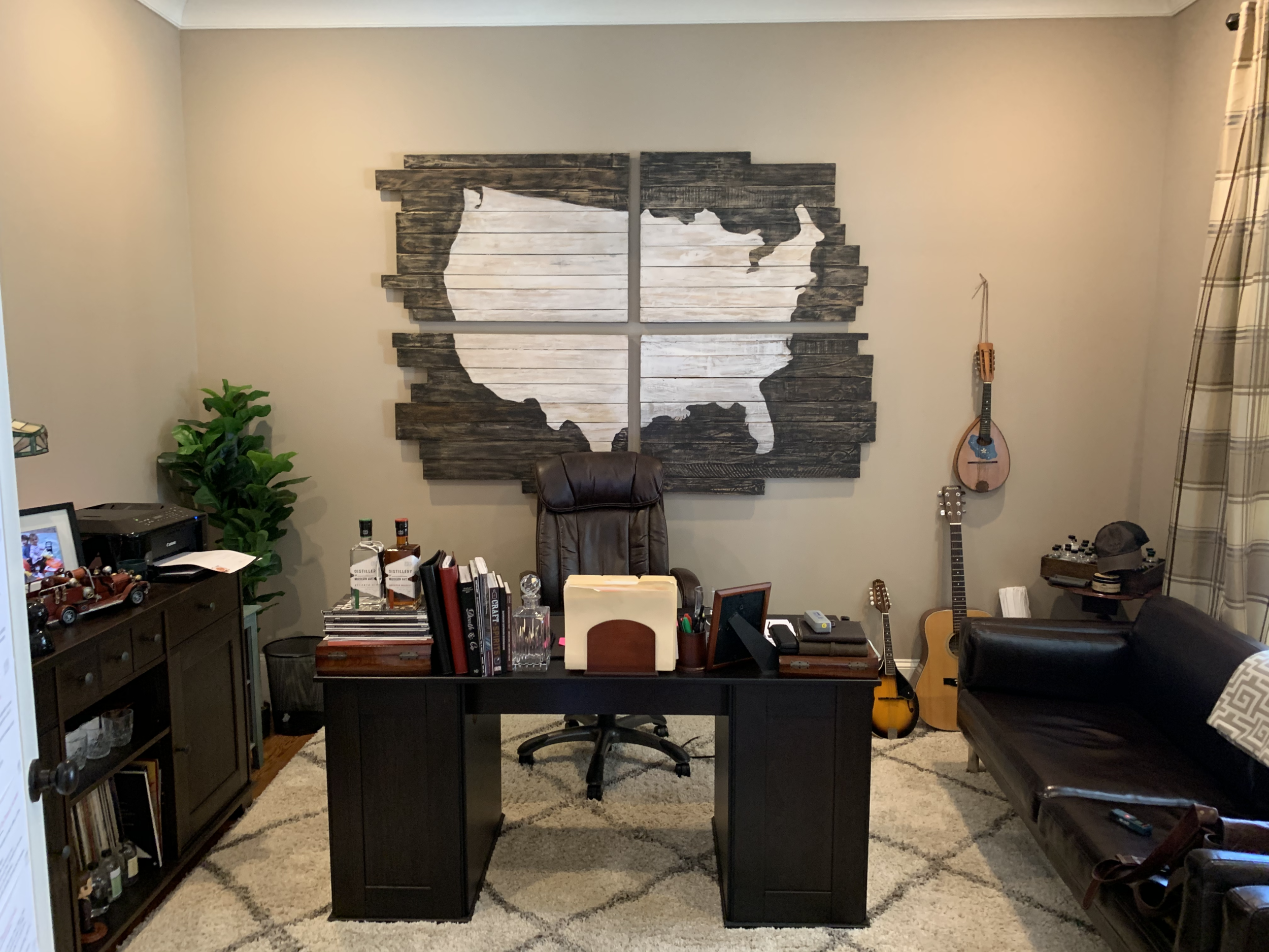
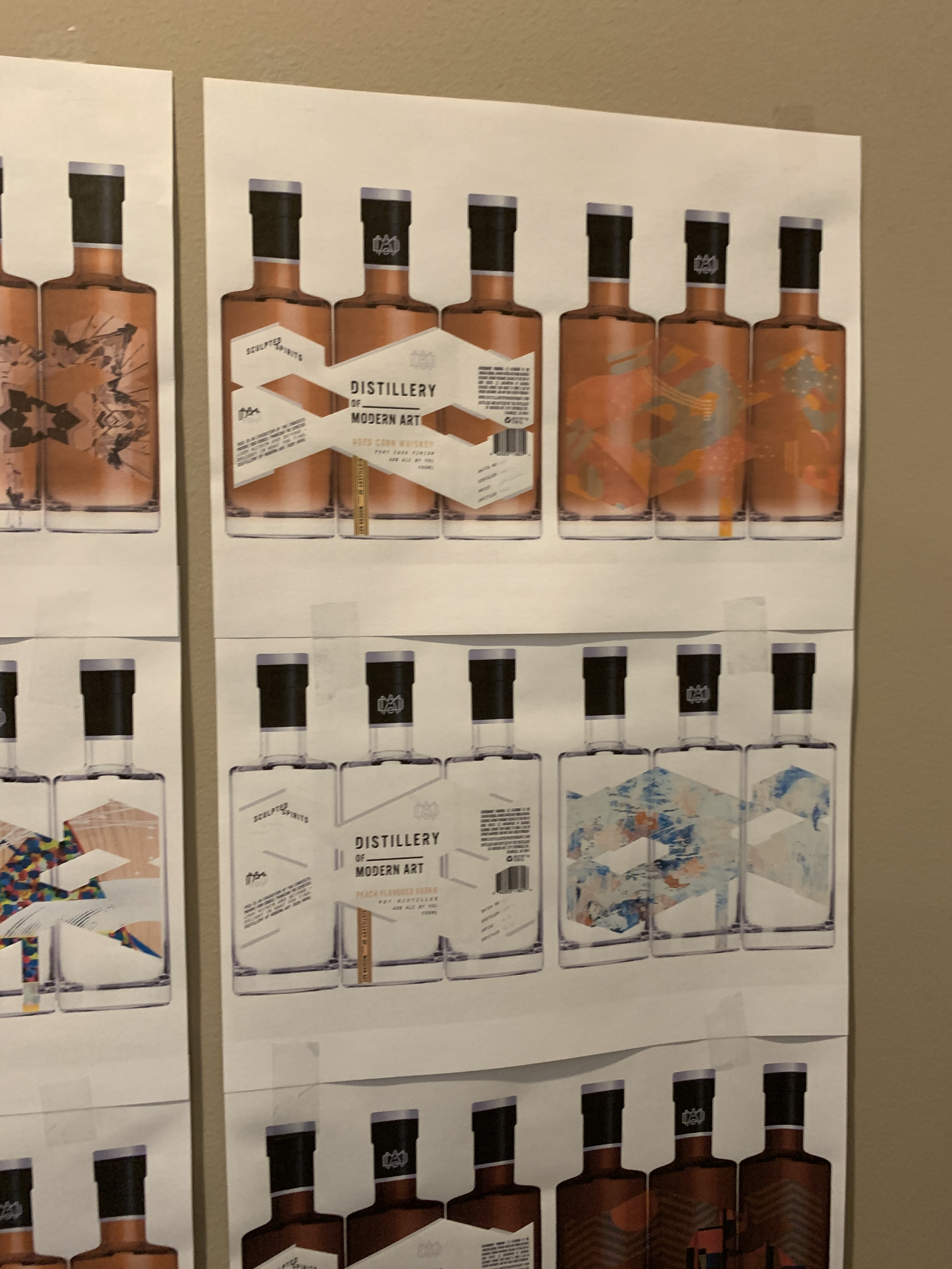
We took this to the next level in the home office where we used the distillery’s bottle label design as inspiration for a one-of-a-kind wall graphic treatment. He also loves to play music, but didn’t want an over-the-top theme, so we used three guitars as functional art. We also added modern graphic window treatments and funky orange armchairs for visitors. The desk and shelving system stylishly houses everything he needs for the business and home life.
After: A home office fit for a Distillery of Modern Art owner.
Before (left): The home office was functional, but didn’t accurately reflect the owner’s innovative and artistic sensibility. (Right): We used the label design as inspiration for the back wall feature that turned out to be a real masterpiece.
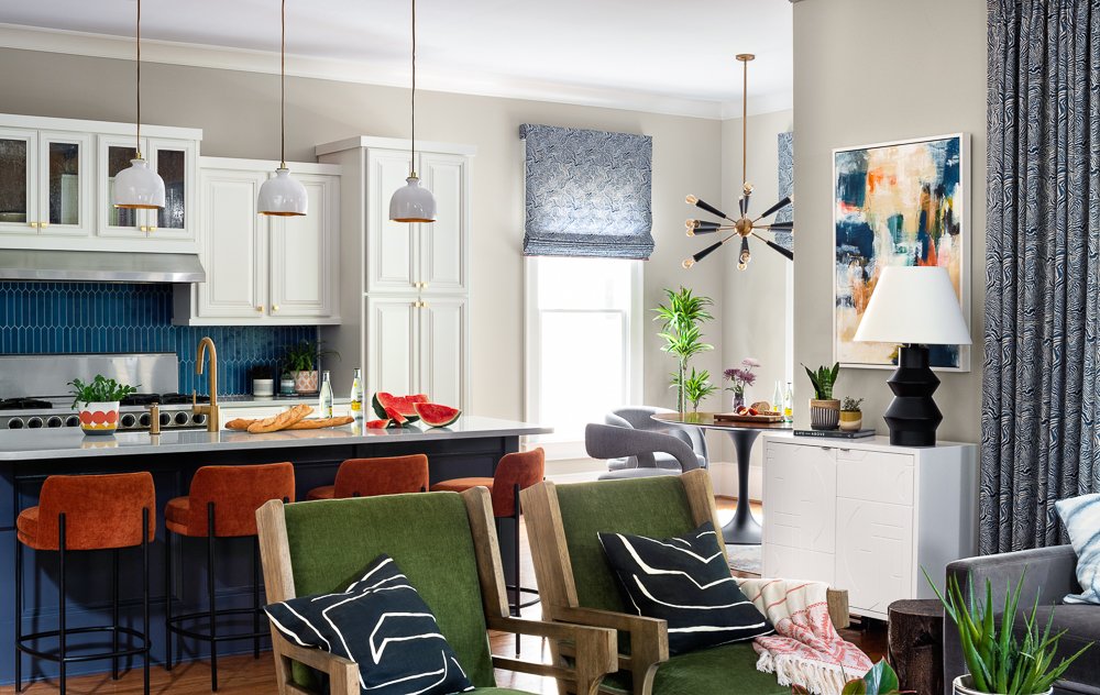
The living room used to be green and had a distinctly Craftsman feel to it, which wasn’t terrible, but also wasn’t them. So we took down the mantel and covered the space with beautiful, graphic tiles. Then we took the top off the built-ins flanking the fireplace, added shelving, and painted it black so it visually melted into the space. Two very luxurious gray velvet sofas and comfy green chairs featuring horizontal wood slat backs complete the inviting hang-out area just off the kitchen.
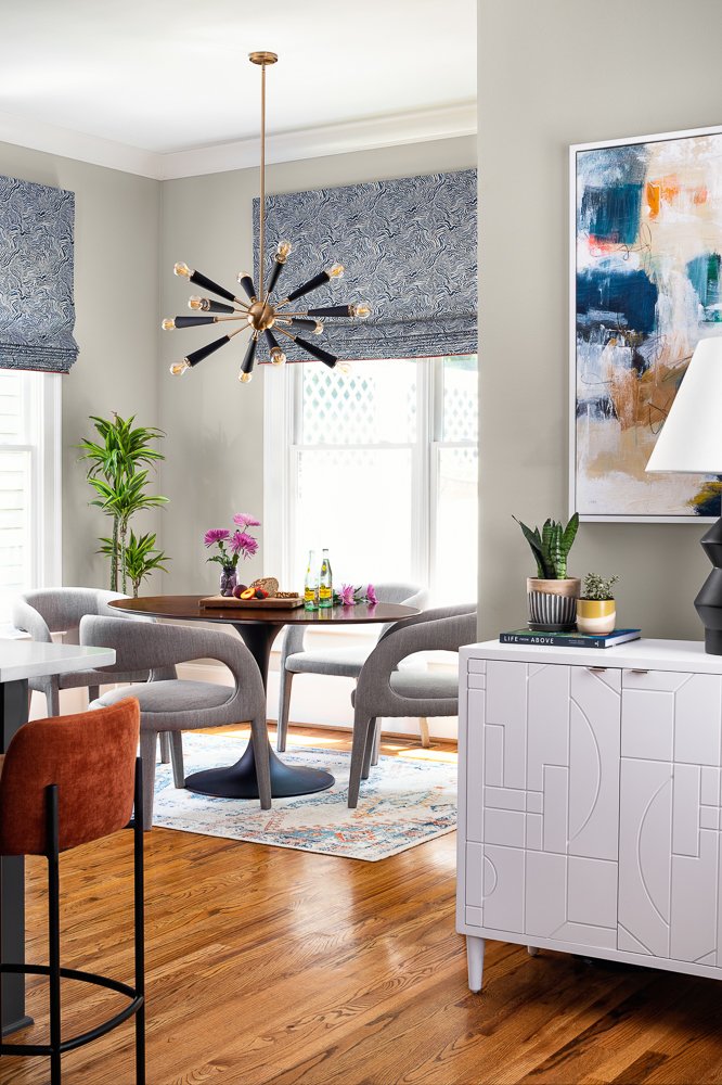
Since it’s an open-concept space, we carried through the design from the living room into the breakfast nook using a similar gray color for the beautifully upholstered chairs and matching fabric from the living room curtains on the Roman shades. The transformation to this area was fairly dramatic since it used to be a play area for the kids, but once we moved that to the basement (more on that in a minute), we could reclaim the nook for family dinners around the modern tulip table under the glow of this very cool Sputnik-style light fixture.
The kitchen itself was in good shape but needed a refresh, so we simply took the grids off the glass cabinet doors, gave it all a fresh coat of white paint up top and blue below, added a modern blue tile backsplash, and laid down a new light-gray countertop. New brass hardware, simple pendant lights over the island, and an apron-front sink with a modern touchless faucet round out the kitchen’s glow-up.
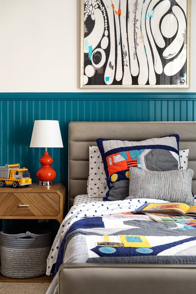
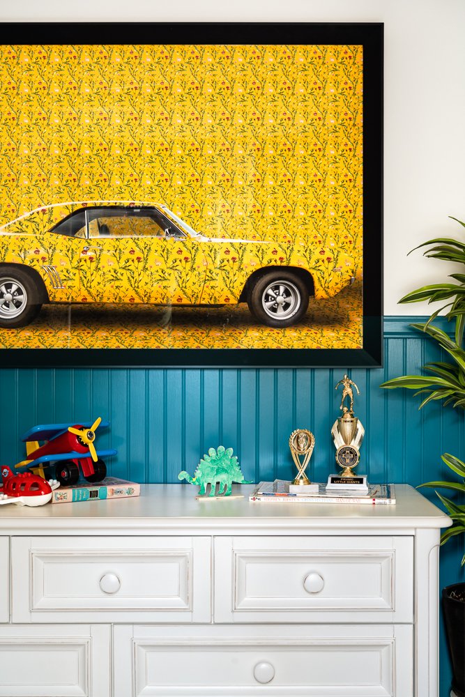
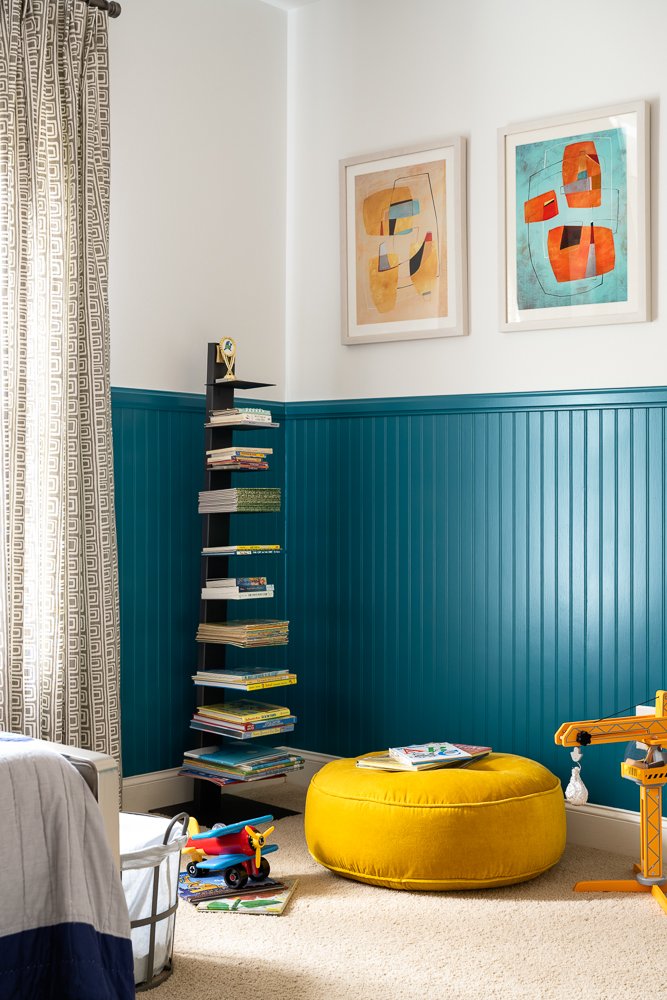
Their little boy loves to read and all things automotive, so we designed a cool-but-not-childish room that can grow with him. We painted the paneling, the trim, the windows, and doors in a vibrant blue-green shade, wallpapered the ceiling in orange and white, and added interesting art on the walls (I am completely obsessed with the floral car picture).
Before, the basement was very blah, if we’re being honest, so we added a fun, graphic wallpaper and brought in a stunning emerald velvet sofa that is perfect for hanging out. A bench on the wall was originally too high for anyone to sit on, so we adjusted it to the right height, added cushions for seating, and made it functional with storage drawers underneath. We finished off the space with a media center and additional storage. Now their home better reflects their creative and fun personality and style!
