Southern Gentleman's Kitchen
Welcome back! We’ve already walked through the transformed foyer and dining room, and today we will FINALLY visit the kitchen. If you remember (because obviously, you’ve been waiting to see this post for MONTHS), my client loves to cook, entertain, and have lots of friends over. Each year, he hosts an epic Friendsgiving. His kitchen just wasn’t reflecting his personality or lifestyle: enter Gina Sims Designs.
When we met to discuss what he envisioned for the space, he knew he wanted a modern, masculine, industrial feel. Let's check out the kitchen before the renovation:
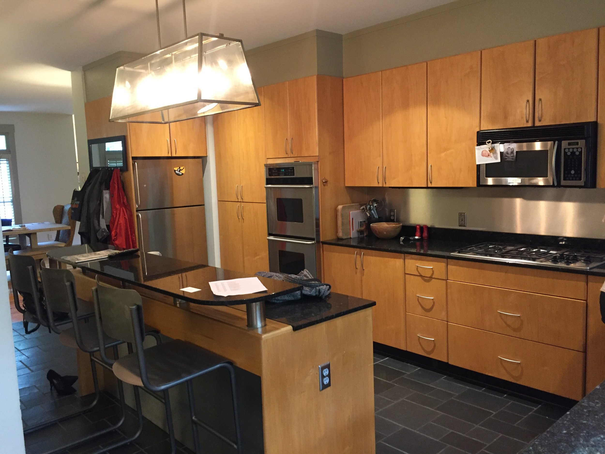
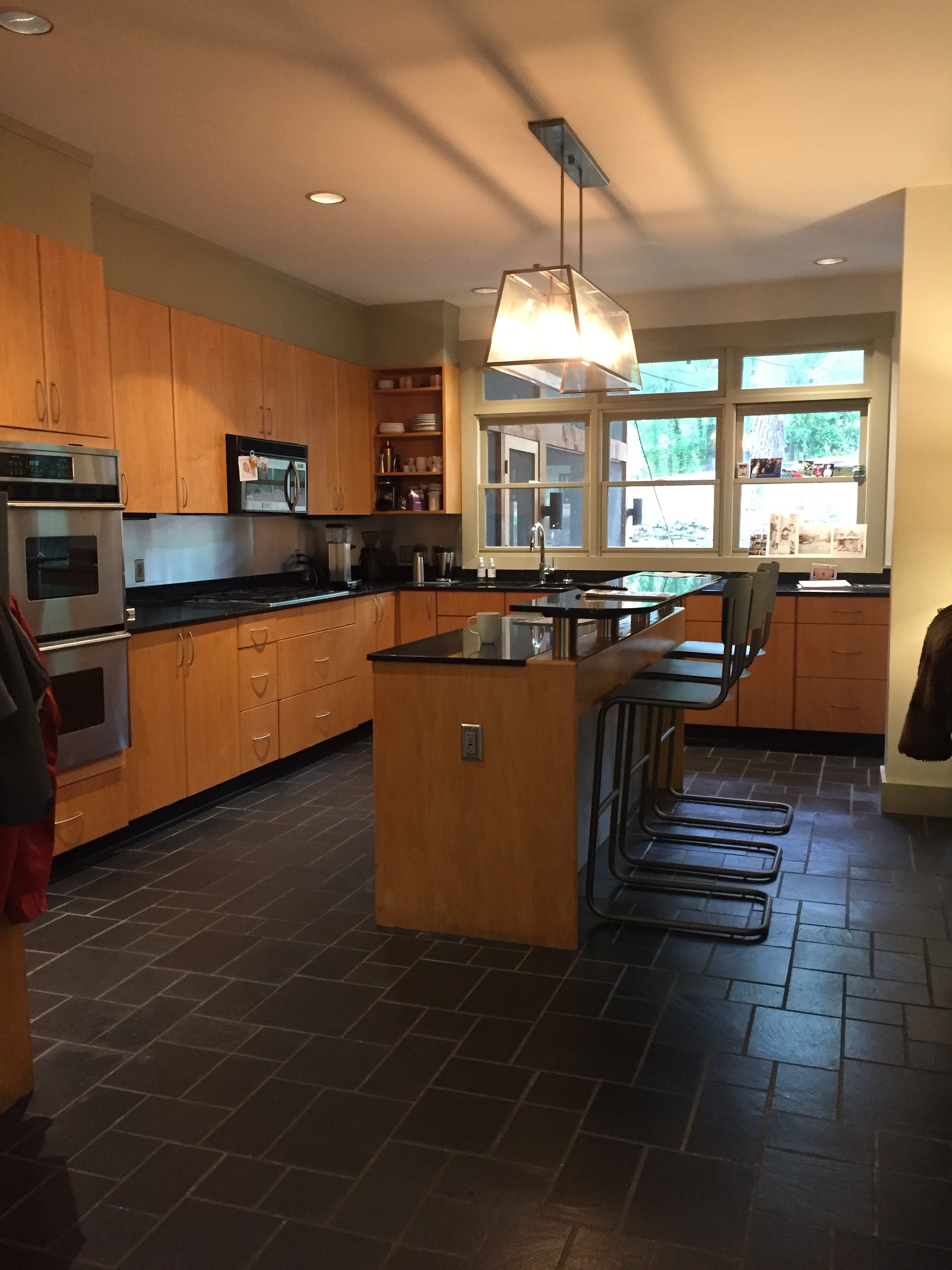
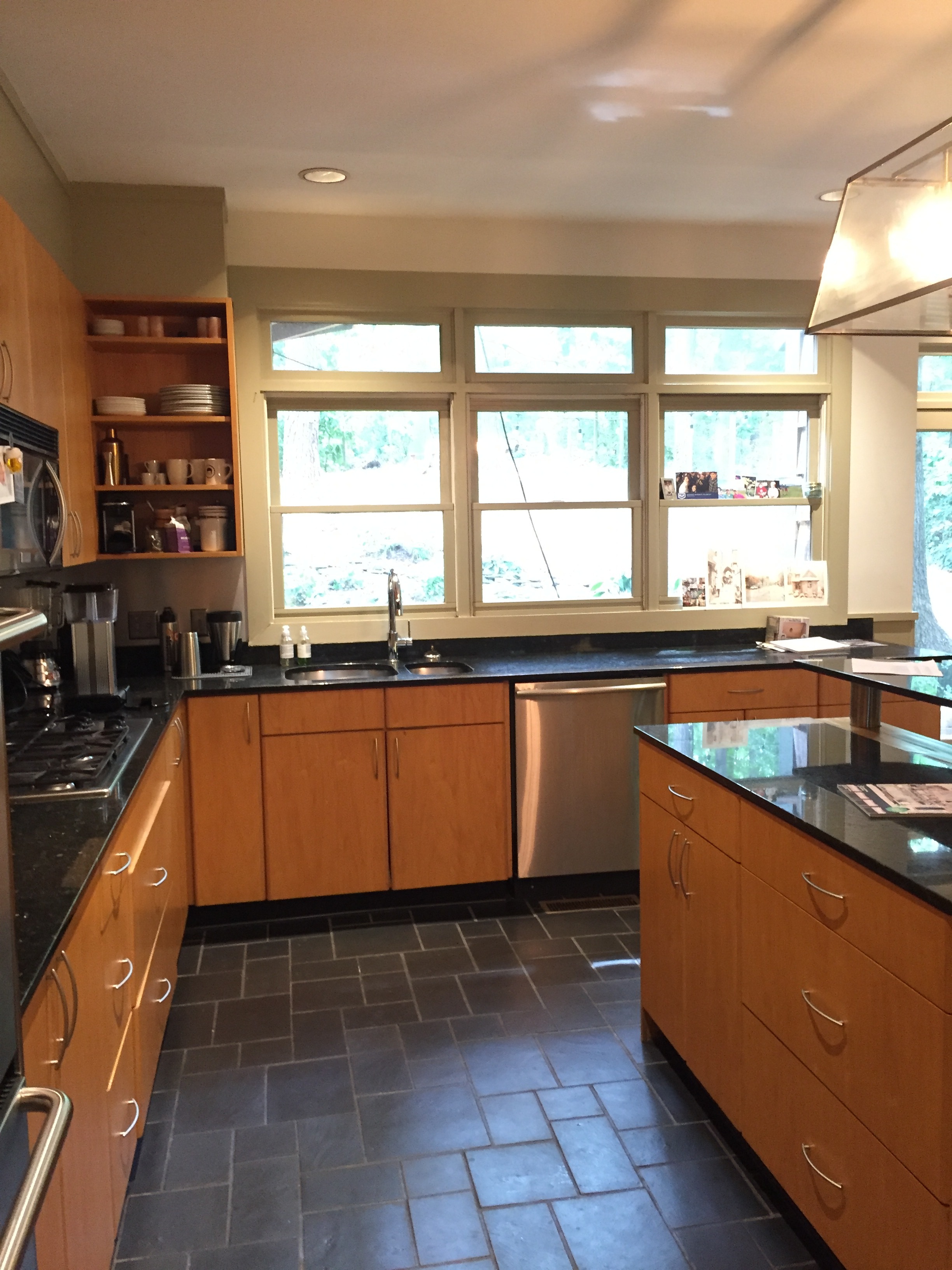
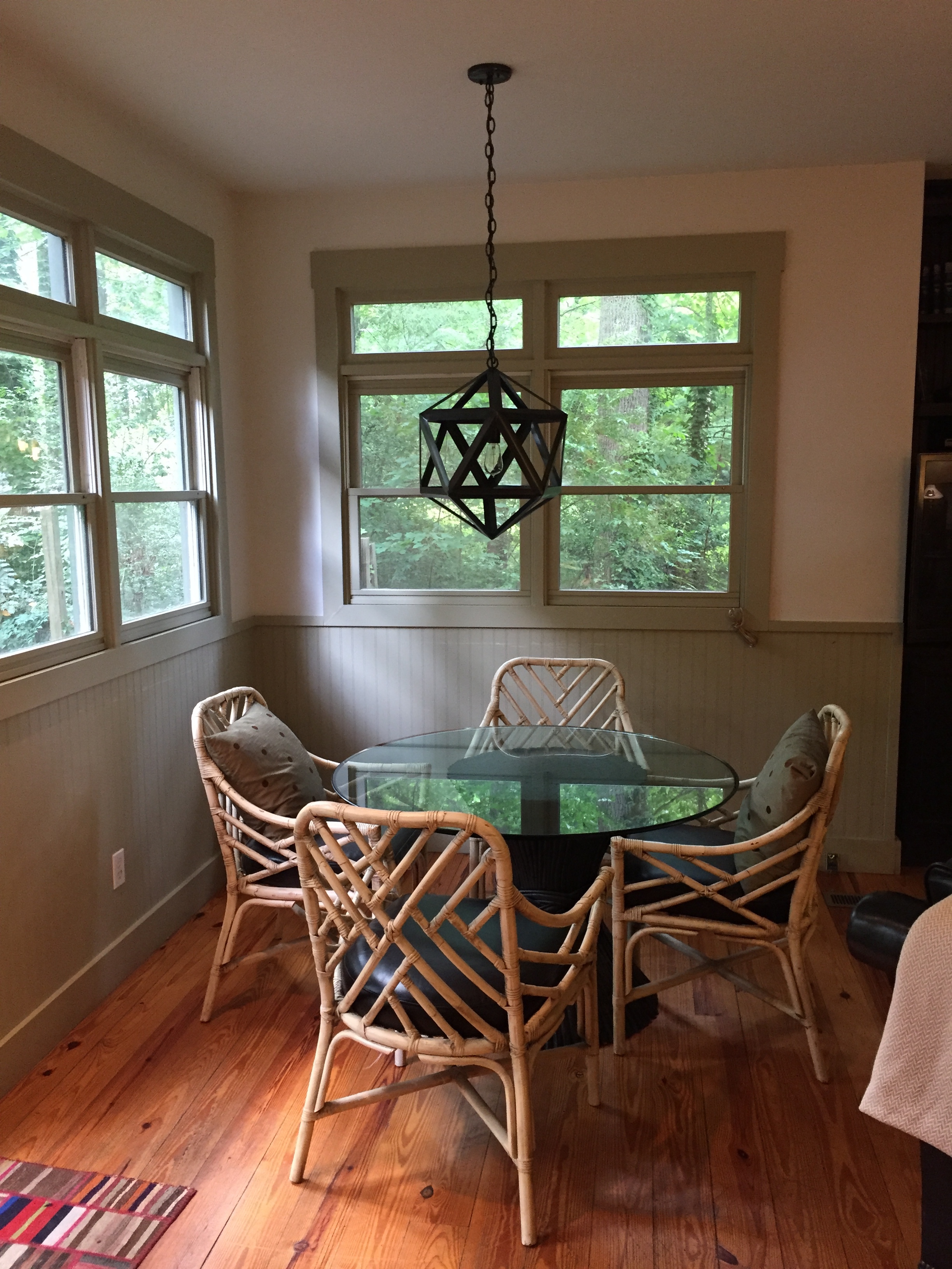
For any kitchen design, you have to evaluate the practical matters of use and function. My client is very tall, so we started with everything being raised up to a comfortable level for him. He loves coffee, so we planned for a hidden away coffee bar. He loves dogs, so the dog bowls were also planned for and hidden in a pull out space. Because he wanted very clean lines in the kitchen, we even planned for the electrical sockets to be hidden from view.
Cati Teague Photography for Gina Sims Designs
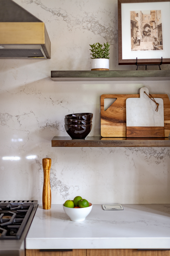
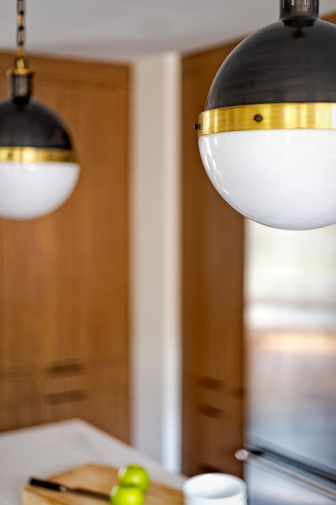
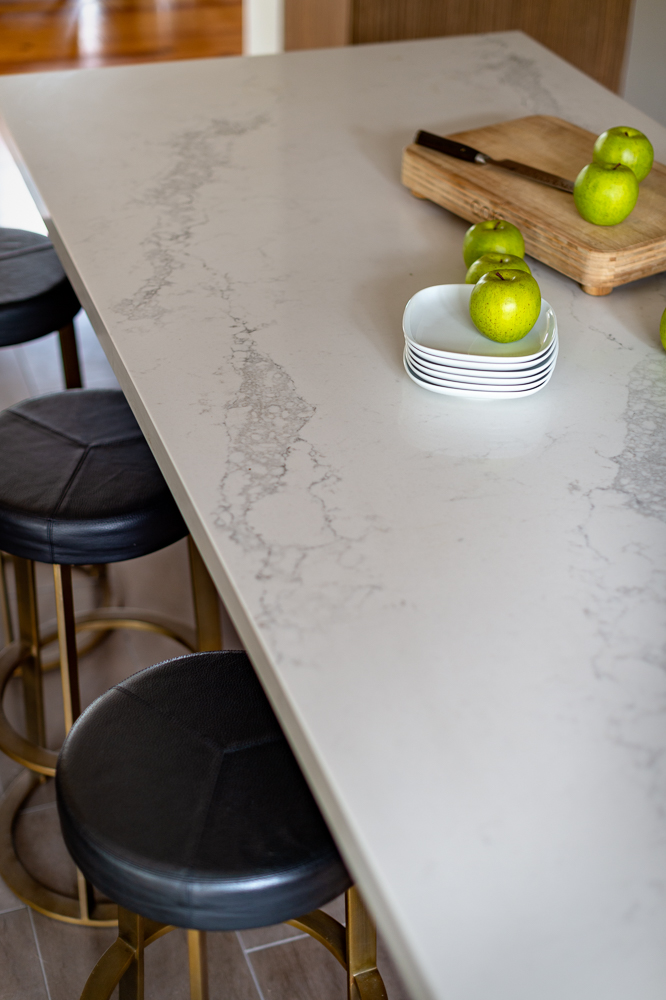
The centerpiece of the kitchen is the custom range hood. It’s wrapped in zinc to really push that industrial vibe, but we’ve warmed it by wrapping it in brass. The warmth continues with the wood tone of the cabinets and the vintage runner. The countertops and backsplash are quartz. The modern, clean look that my client wanted is achieved by using a slab of quartz as the backsplash. We opened up the kitchen by using custom raw iron shelves, lit up by those fantastic sconces from Rejuvenation. The leather and brass bar stools communicate that masculine feel while providing guests with a comfortable seating area when enjoying the new kitchen.
Cati Teague Photography for Gina Sims Designs
The breakfast nook was transformed with a set of black cerused chairs from Interlude Home, which surround the client’s kitchen table. The window sashes were painted black to make the room more architecturally interesting. The geometric pendant gently lights the space, strongly complimenting the industrial, black, iron look of the room.
Cati Teague Photography for Gina Sims Designs
We still aren’t done with this space! Soon, we’ll feature the living area off the kitchen and the ah-may-zing bar area. #spoileralert: there are patina mirrored tiles. Stay tuned! To keep up to date with sneak peeks: make sure to follow Gina Sims Designs on Instagram at @ginasimsdesigns and on Facebook. The following images were taken by the amazing Cati Teague Photography for Gina Sims Designs.
